
FormX :
Apr 20, 2022
If you’re not getting sales, signups, or even emails from your website, you need to look at your contact form. Here’s why: Your users’ attention is spread across multiple pages and content. You might be lucky enough to get them to read an entire blog post, but they will be distracted when they hit the end of it. And if you don’t have a call to action (CTA) on your page, they won’t know what action to take next.
What is a contact form?
The contact form is the one CTA that should be on every page of your website. It provides a simple way for your visitors to get in touch with you by filling out a short form. It often asks for the person’s name and email address and may also ask for other relevant information like their company name or phone number. The form can be used as a direct link between you and your visitor—like when someone fills out a lead generation form or signs up for a newsletter. Or it can be used as an indirect link—for example, when someone comments on a blog post or sends a quick question about their service or purchase.
Why do contact forms have abysmally low conversion rates?
The problem with most contact forms is that they are boring. They say things like “Name”, “Email Address”, and “Message”. And then there’s a button to “Submit”. This makes people yawn, and click away from your form immediately.
If you want people to fill out your contact form, you have to make it more interesting for them than for you. The purpose of the form is not to collect data; the purpose is to give your potential customers something compelling in exchange for their time and attention.
13 Contact Form Best Practices You Need to Know
Place only your contact form on a page — no distractions
If a company’s website brings you to a contact form, it’s kind of a big deal. If the form is the only way to get in touch with the company, it’s even bigger. But most companies manage to screw that up.
The worst thing they usually do is put too many distractions on that page.

(Source: Replit’s contact form)
Display social proof near your contact forms
Social proof includes any content (testimonials, reviews, media logos, endorsements etc.) that help to build trust and confidence in your brand. It’s the most simplest way to increase submission rates in contact forms
Social proof is one of the most powerful conversion rate optimization techniques. It is a quick and easy way to establish trust and credibility with your visitors. This means they are more likely to convert!
There are several reasons why social proof is important, but it can be summed up in this statement: “When people see others doing something, they are more likely to do it themselves.”
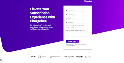
Source: (Chargebee’s contact form)
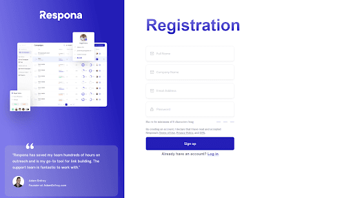
Source: (Respona’s contact form)
Tell users what they will get if they submit a form
When a user sees a form, they won’t fill it out unless they think they’ll get something out of it. For example, if they’re signing up for an email newsletter, they expect to receive emails. If you make them guess what they’re going to get out of the deal, most will guess wrong.
Make sure you tell the user what they will get from filling in the form. Will they get a quote? A free trial? A call back? Will they be added to a mailing list? Whatever it is, make sure it’s clear and that your visitors know exactly what to expect when they submit their details.

Source: (Salesforce’s contact form)
Responsiveness and mobile optimization
Ensure that your contact forms are responsive and mobile-friendly. With an increasing number of users accessing websites from their mobile devices, a seamless experience across all screen sizes is vital. This means optimizing the form layout, text size, and button placement to work well on both desktop and mobile devices, ensuring a smooth experience for all users.
Form field validation
Implement real-time form validation to inform users about any errors or missing information while they are filling out the form. This helps prevent frustration and improves the user experience by allowing users to correct any mistakes before submission. Implementing clear and specific error messages can guide users on how to fix the issues and ultimately increase form completion rates.
Limit the number of fields
Reduce the number of fields in your contact form to make it less daunting for users. Ask only for essential information, as lengthy forms can deter users from completing them. By focusing on collecting only the most relevant information, you can streamline the process and increase the likelihood that users will complete and submit the form.
GDPR compliance and data privacy
Make sure your contact forms are GDPR-compliant and inform users about how their data will be handled. This can include adding a privacy policy link or a consent checkbox to your forms. Transparency about data usage and storage can build trust with your users and ensure that your business stays compliant with data protection regulations.
Continuous A/B testing
Continuously test and optimize your contact forms by running A/B tests on various elements such as form length, field labels, CTA text, and form design. This will help you find the best-performing combination for your specific audience. Regularly analyzing test results and making data-driven decisions can lead to improved conversion rates and a more effective contact form overall.
Use directional cues
Directional cues are what help users understand how to use a contact form. This is important because if your users don’t know how to use a contact form, they can’t interact with you.
Directional cues also teach users where to put their information. If they don’t know where to put their information, they’ll likely be confused and not complete the action.
Some examples of directional cues are: placeholders, labels, and formatting.
Check your form load time
It’s very important to test your forms before you make them live. If users have to wait longer than a few seconds for the form to load, they’re going to look elsewhere.
The other day, I spent ten minutes filling out a form, only to have it fail on the last page. I clicked submit, and nothing happened for a few seconds, and then the whole page disappeared. I’m not sure if my data was submitted or not.
This is why it’s important to test your forms in real-world conditions, with real users. Did you know that most people will start getting frustrated if a page takes more than five seconds to load? Most users won’t bother to wait for your slow page if they can go somewhere else and get their information faster.
Add a ‘thank you’ page
Adding a thank you page after form completion is important firstly because it provides a way of acknowledging the user that their request has been received. It confirms that they have successfully submitted the form and that the data was sent to your email address.
Secondly, it provides a way for you to drive extra value to your users. You can upsell the products and services on your thank you page or even provide additional resources that may be of interest to them.
Experiment with different CTAs. Use strong verbs
You already know the value of calls-to-action. They drive conversions, after all. But what you may not know is that the CTA copy you use can also have a big impact on form performance.
Experimenting with various CTA copy options on your contact form could be an easy win for your business. Here’s how to get started:
Start by testing different verbs within the same CTA copy option (e.g., “Submit this form” vs. “Send this info to us”). If those tests give you promising results, move on to testing different sentence structures (e.g., “Submit this form” vs. “Submit now”).
Change one element at a time so it is easy to determine which element made the difference in your conversion rate.
When in doubt about what action to encourage people to take on your form, use common sense and stick with something simple like “Submit” or “Send”.
If you want some inspirations for CTA copies, read our blog with 30+ examples here:
Play around with the design of the CTA button
If a CTA button doesn’t stand out, it’s unlikely to be clicked. The buttons that catch the eye are typically larger than the rest of the page and have a contrasting color. This often has a positive effect on conversion rates because visitors are able to see where they need to click and what they’re getting in return for their click. In fact, CTAs can have such a large impact on conversions that it’s worth running A/B tests to see which design performs best.
Conversions are important and you can improve them by simply changing a few elements on your contact form.
P.S: Are you looking to add a contact form to your static website? << Read our easy guide.