
No website (or form) is complete without a strong CTA. The CTA is the final step in your conversion process. It should represent the culmination of your marketing plan and what you’re ultimately hoping to achieve through your marketing efforts. When implemented correctly, CTAs can be the difference between success and failure.
What is a CTA
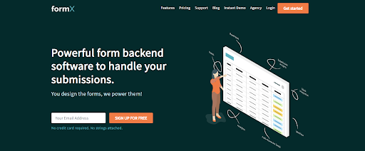
A CTA is a call to action. It directs your reader to take a specific course of action. The most basic example is a button that says, “Buy now,” by which you are prompted to click here to complete the purchase. Another example of a CTA would be, “Click here to sign up for our newsletter.” For example, here, the orange buttons that say ‘Get started’ and ‘SIGN UP FOR FREE’ are CTAs.
CTAs: The ultimate weapon to increase form conversion rates
Having a CTA on your landing page, and making sure it’s visible and accessible, is crucial for several reasons. First of all, people are more likely to click something if it’s presented as an active choice. If you have a blog article with a link at the end that says “Read my next blog post here,” visitors will be more likely to follow through than if you just say “you can read my next blog post here.”
It’s also important because it helps maintain the flow of what you’re trying to accomplish with your website. Each link and CTA should lead users along the path of getting them to convert or subscribe. The goal of your website or landing page is ultimately to collect contact information, so CTAs help ensure they don’t get distracted along the way, or mistakenly believe that they’ve reached their destination already. A “read more” CTA will let them know there’s still another step in their journey, while also letting them know what their next step should be. Plus, “read more” makes it sound like there’s something in it for them
Experimenting with CTAs should be a priority in your marketing plan
Let’s be real: not all CTAs were created equal. Some inspire you to click, others don’t. Some are clear and confident, while others are wishy-washy and unsure. And that means there’s room for improvement. But how do you know what makes a good CTA?
Simple: Testing. Try experimenting with different factors like color, shape, placement, size, and more. Then, observe how these changes impact the performance of your CTA. If the results aren’t what you had hoped for, switch back to something else. But if the results are promising, keep going in that direction—and see where it takes you!
What you should keep in mind before experimenting with CTAs
CTAs work best when they are concise, relevant, and clear. They should always measure up to the promise they make and should lead to a specific landing page where visitors will find more information about what they just clicked on. For example, if you have an ad for a free ebook (the CTA), when someone clicks on it, they should be brought to a landing page with more information about the ebook and how it can benefit them. The CTA itself shouldn’t go into too much detail about what it’s offering; otherwise, you won’t entice people to click on it. The goal is not only to get people to click on your CTA but also to convert readers into buyers or subscribers.
What makes a CTA great
The CTA on your page is the one place you can’t be afraid to use some visual flair. Experiment with different colors, sizes, shapes, and placements to determine what elements catch the eye of your audience. But don’t lose sight of the fact that while you’re testing and experimenting, it’s important to remember what you’re trying to do: get people to click.
Designing Effective CTAs
One of the first things to consider when choosing a CTA button color is what it will contrast with. Will it pop against a dark background or blend in with a light one? Should it contrast most with the header or footer? You want your CTA button to stand out from its surroundings without looking too out of place. If you’re working with an existing theme, stay within the same color family as your other design elements; you’ll want to use something that’s part of the same palette so your CTA button doesn’t look like an afterthought. Next, think about what you want people to feel when they see your CTA button. Do you want them to feel happy? Peaceful? Excited? We have a blog just dedicated to how button colours influence the performance of a CTA, read it here.
Writing Effective CTAs
You know the goal of your website, and you know the purpose of your marketing campaign—but does your audience? If your call-to-action isn’t answering that question for them directly, then it’s failing. Use actionable language. “Purchase” is more effective than “Buy,” “Submit” is better than “Enter.” Be specific about your offer. Instead of “Learn More,” try “Get My Free White Paper.” Content in CTAs is so important that we’ve written two blog posts on that. Read how to write kick-ass CTAs that people will surely click on here, and how to use AI writing tools to brainstorm for CTAs here.
Placement Matters! Where Should You Put Your CTA?
Placing the right CTA in the right location can make all the difference when it comes to encouraging your website visitors to interact with your brand. Where should you place your CTAs? The answer will depend on what type of business you run and what goals you have for your website. If you’re trying to increase subscriber numbers, you may want to consider placing a CTA at the bottom of each blog post, so that readers can easily sign up for updates once they’ve finished reading an article. If you’re hoping to attract more new customers, make sure that there’s a large CTA near scroll bars on each page, so that visitors can quickly get in touch with you or learn more
With the right design, placement and wording you can create effective CTAs that will convert. Interested to know how else you can boost the conversion rate of your forms? Read our blog here: https://formx.stream/blog/web-form-optimization/
Leave a Reply